Tuesday, September 23, 2008

Modern Alphabet


The Modern Alphabet- more formally know as the modern Latin alphabet is composed of 52 upper and lowercase letters (26 of each). The lowercase letters are developed from cursive versions of the uppercase letters. Then come 10 numerals (0-9), which can be used to form any number. The alphabet also consists of symbols, punctuation marks and accents that are used for other languages.
Not all alphabets are made up the same, some are missing letters and some have added letters. For example the Spanish have 30 letterers because of addition of ñ, ll, ch, and rr whereas some languages are missing letters such as Italian. The Italian alphabet is composed of 21 letters, and lacks “J”,”k”,”w”, and “y”.Accents and stresses have come into the alphabet to provide visual guides to the pronunciation of letters and words by giving an example of how each letter should sound. Common accents are ones such as Acute, circumflex, breve, grave, umlaut, and the tilde. For example the tilde over a letter indicates that a more nasal pronunciation is required. And the circumflex indicates that a vowel has a long sound.When it comes to numbers they are derived from Arabic characters. It was this adoption that was the birth of “0”. It didn’t commonly become used until the renaissance period. Numbers, which at the time were letters, were soon modified and simplified into Roman numerals. This was to simplify the writing of infinite length numbers with much more ease. For example m = 1,000. With math, Roman Numerals were also not the easiest to use whereas the Latin number system worked easily.

How many letters are included in the modern Latin alphabet?


http://www.omniglot.com/writing/latin.htm#modern
The Fundamentals of typography

Tuesday, September 9, 2008

Adrian Frutiger


Adrian Frutiger is a typographer from Switzerland born in 1928. He originally took interest in sculpture but was pressed against it by his father and teachers. He then got into printing where he held an internship at 18 working as a compositor and working on Roman rubbings. This eventually took him into the career of developing types. He is accredited with creating many of different typefaces. In 1987 he was awarded a Type Directors Club award for his contributions to the type world. His first typeface that he created was president, which didn’t draw as much attention as his later works. He is most known for Frutiger and Univers.

Univers was created in 1956, which is a typeface with even stroke widths and a large x height. It is unique because of its numbering system. Every version on Univers is numbered depending on its different components. This is unique because before this time all fonts were labeled by names and Univers was the first font typeface to bring a number into the labeling process. There are currently 27 different variations of Univers. Univers has a large x height, which makes it very usable. It can be used as large fonts or small fonts and still appears very legible.

http://typophile.com/node/12118

http://en.wikipedia.org/wiki/Univers

http://www.myfonts.com/person/frutiger/adrian/

John Baskerville


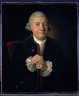
John Baskerville was an English typographer and printer who lived from 1706-1775. He was part of the Royal Society of Arts. His career started as japanning, which is the art form of decorating metal with varnish. He was known for his intricate types and close attention to detail. He is most noted for his masterpiece Bible, ironically as he was an atheist, commissioned by Cambridge University press. His fonts consisted of level serifs and attention to light and heavy lines, which was very different than others at the time. He believed in elimination of anything to ornate that distracts from the purpose of reading. His font designs were very practical which made them so unique, especially for the era in which he was producing them. He made books with large type and small margins. He showed an extreme care for not only the typeface but also to the type of ink and paper being used. It was his fonts that led the way for fonts such as didot and bodoni. It was after Baskerville died that his fonts disappeared for a time. Eventually making a come back. It is because of his use of white space and simplicity that people like his font style. The font Baskerville however was not created by John himself but rather created from studying of his style and books that he produced through his lifetime.


http://www.infoplease.com/ce6/people/A0806405.html

http://ilovetypography.com/2007/09/23/baskerville-john/

http://en.wikipedia.org/wiki/John_Baskerville

encyclopedia.jrank.org/BAR_BEC/ BASKERVILLE_JOHN_1706_1775_.htm/

http://www.myfonts.com/fonts/storm/john-baskerville/

Tuesday, September 2, 2008

Grids

- why do we (designers) use a grid? what are the benefits or functions?
-- include any online links, research, thoughts, examples...

Grids overall bring organization to layouts. By using a grid it will unify page layouts and make everything flow with a lot more ease. On top of the benefit of everything flowing it also helps make pages more "systematical"(grid based design) and helps logically. Grids help in adjusting height and width of images and text so that everything works in a page layout. Grids are becoming large in not only typographical layouts but also becoming heavily dominant in web design.

Grids are also very helpful for viewers. They organize information in a hierarchy of information by importance. It also helps a viewer to know what order links, pictures, and text are supposed to be taken at.

p.s. my links are below and aren't working so those will be up shortly.


">